Studio52
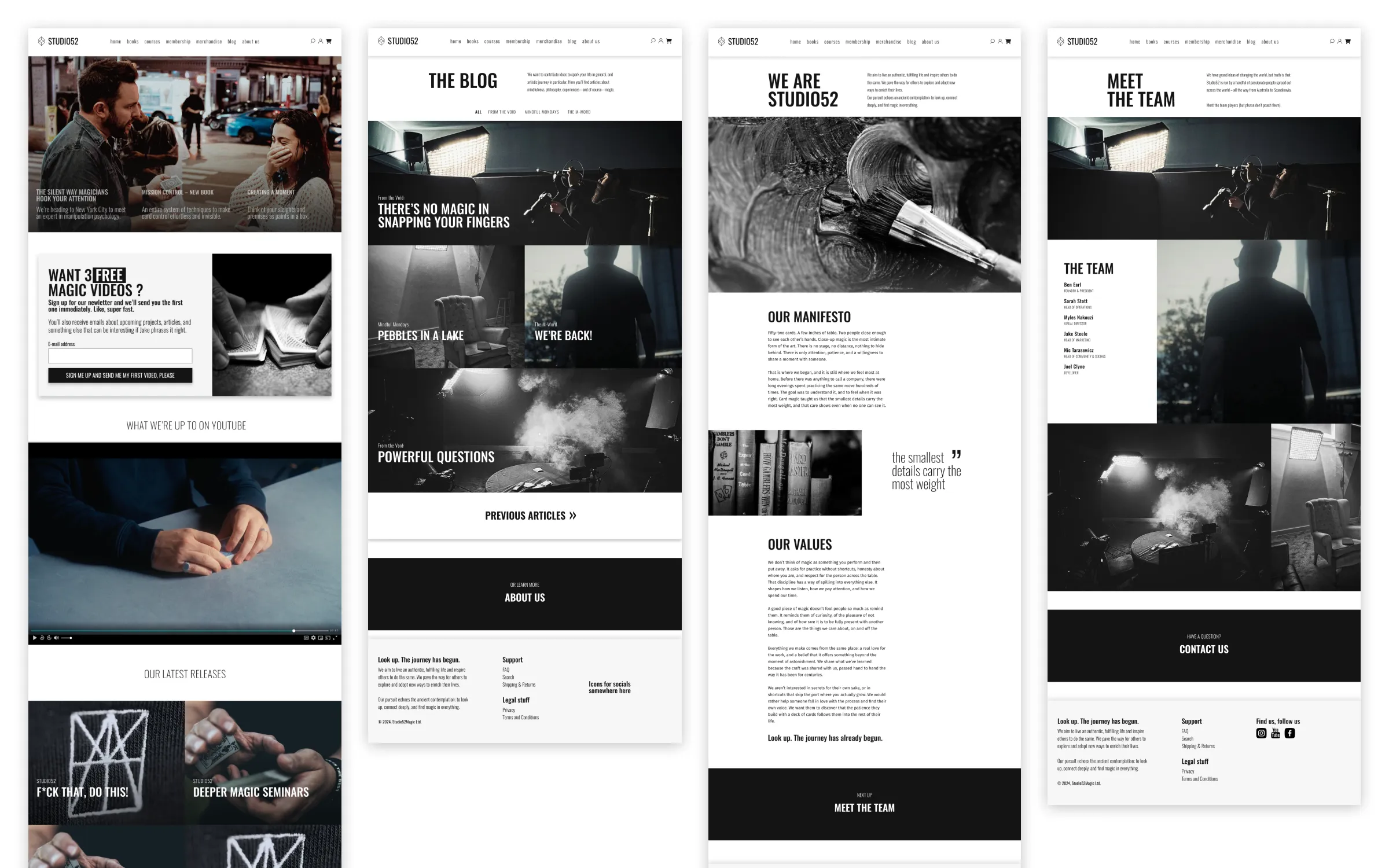
A new website for a close-up magic education brand: structure, visual design, copy and an interactive prototype.
- Role
- Information architect, visual and interaction designer, copywriter
- Client
- Studio52
- Year
- 2024
- Scope
- Information architecture
- Visual design
- Interaction design
- Copywriting
- Interactive prototype
- Handoff
- Status
- Delivered
Studio52 makes educational products about close-up magic, and I had the privilege of designing their new website.
The brief
Studio52 didn’t feel that their existing website represented them as a brand. They wanted something that gave an impression of professionalism and authenticity: that they were genuine, that they cared about quality, and that they weren’t just in it for the money.
The site is for two kinds of visitors: people who want to start learning close-up magic, mostly card magic, and magicians who already know the craft and want to fine-tune and improve their skills. It’s also a shop, selling books, courses, a membership and merchandise.
Constraints
As a startup, they needed me to move fast and efficiently. It took two weeks from our first meeting to the first prototype, and another week to deliver the full design.
My role and the team
I worked as a long-term contract freelancer, directly with the owner and director, Ben Earl, and with input from the visual director, Myles Nakouzi, and the head of marketing, Jake Steele. I handled the information architecture, visual design, interaction design and copywriting. The design was then handed over to their developer.
Information architecture
I based the structure on interviews with the team, an analysis of competitors and my own experience. The main decision was to scrap most of the sales talk and go storytelling-first, so the pages build the brand and feel authentic and cared for.
Visual identity
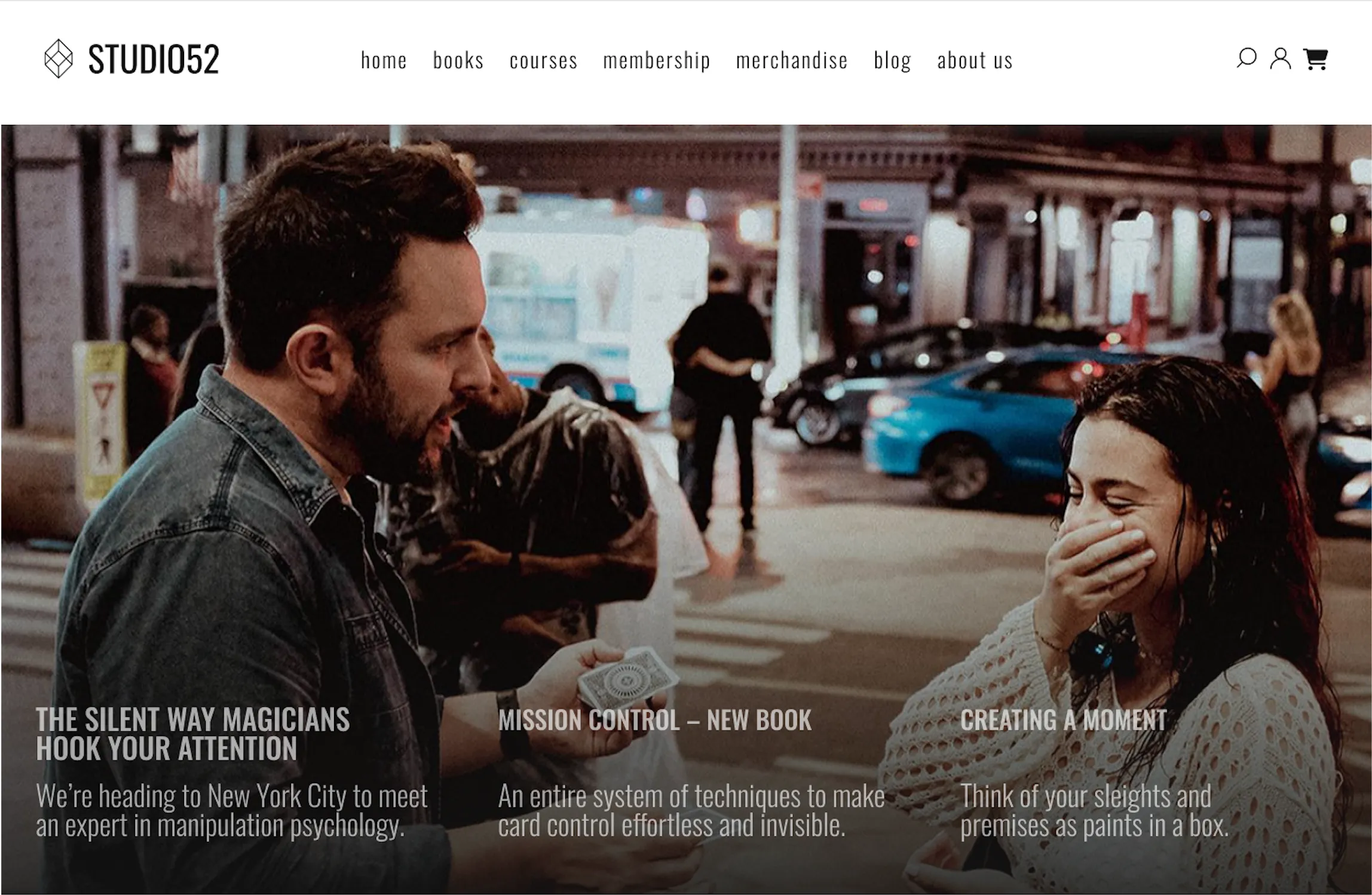
The only parts of the existing branding I kept were the logo symbol and their photos, with one or two added by me. The rest of the look and feel was new, built to give the impression of professionalism, authenticity and quality.
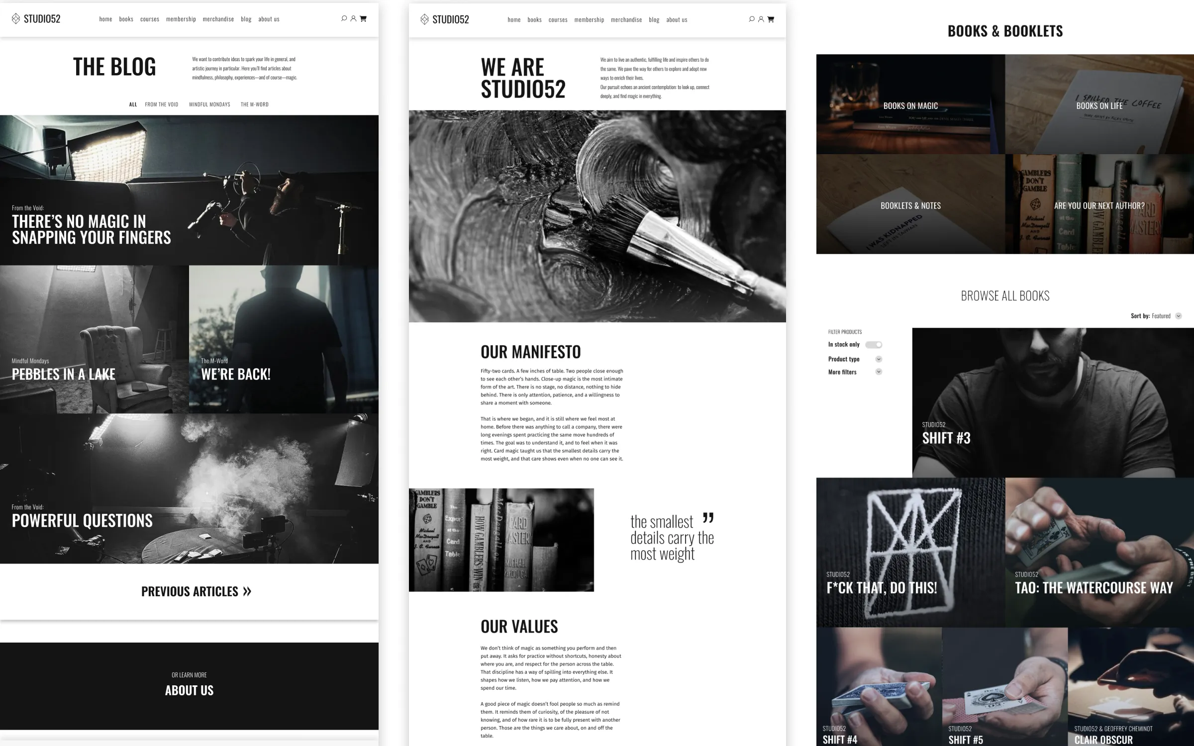
Prototype and handoff
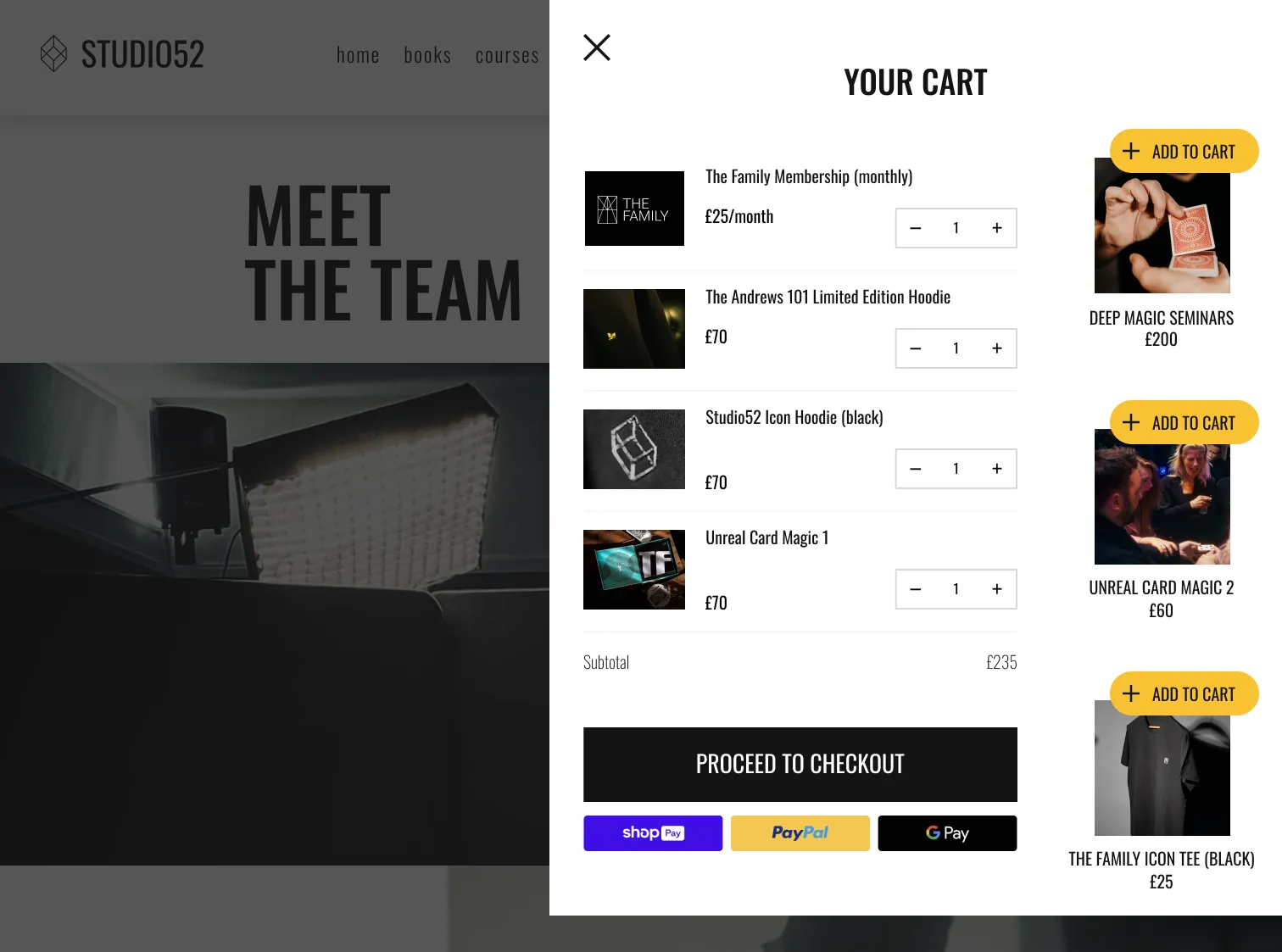
I built a high-fidelity prototype in Figma, with most elements interactive. Beyond fine-tuning a few details, the feedback led to the addition of upsell options in the cart. They wanted some kind of upsell, and I suggested placing it in the cart, since that reaches people who are already in the middle of a purchase.
I handed the design over for development in Shopify (Liquid): the full Figma file with specifications, and a meeting where I went over the design details with the developer.
Result
The full design was delivered three weeks after our first meeting, and the site launched in 2024. Reactions from their customers were highly positive, and the site matched how they wanted to be seen: genuine, quality-minded and not just in it for the money.