Clair Obscur
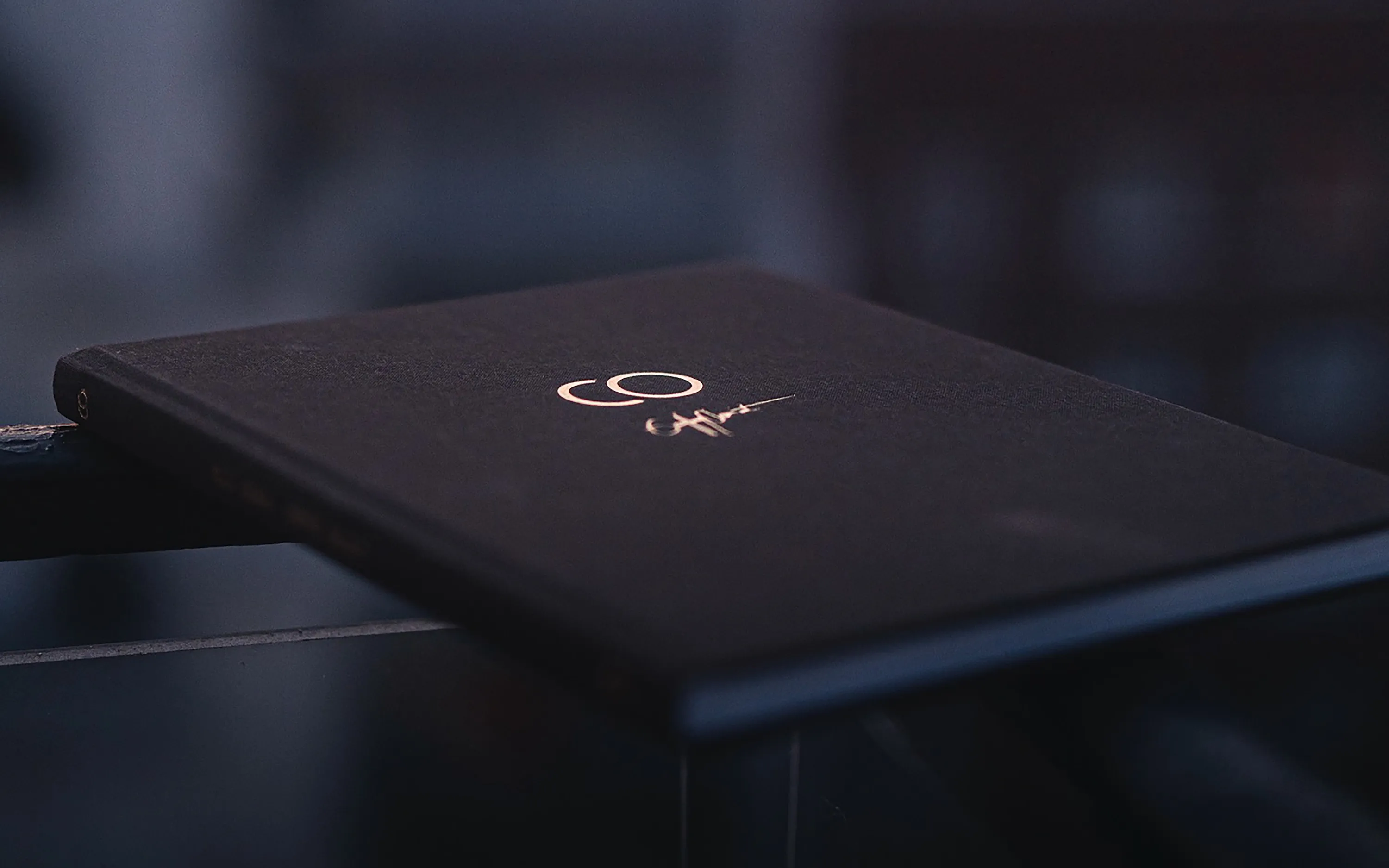
Concept, layout, typography and cover for a limited-edition hardcover magic book by Geoffrey Cheminot.
- Role
- Book designer, with Josefin Magnusson
- Client
- Geoffrey Cheminot and Studio52
- Year
- 2024–2025
- Scope
- Concept
- Layout and composition
- Typography
- Cover design
- Status
- Released, sold out
Clair Obscur is the debut English book by the French author and magician Geoffrey Cheminot, a limited first edition produced by Studio52. In it he explains seven of his own routines. It has forewords by Ben Earl and Nic Tarasewicz and an afterword by photographer Nicolas Nargeot, who took all the photographs.
I worked on everything together with my partner and fellow designer Josefin Magnusson: concept, layout, composition, typography and cover. The work took place during parts of 2024 and early 2025, and the book was released in February 2025.
The brief and audience
Geoffrey and Studio52 wanted to gather the best team they could for this book idea: Geoffrey’s magic, Nicolas Nargeot’s photographs, and Josefin’s and my design. We talked about how it should be more than a standard instructional book, it should work just as well as a beautiful coffee table book.
Clair Obscur means twilight, the time of day. Studio52 describes the audience as anyone passionate about magic, “from those refining their close-up repertoire to performers seeking deeper meaning in their craft.”
Format and grid
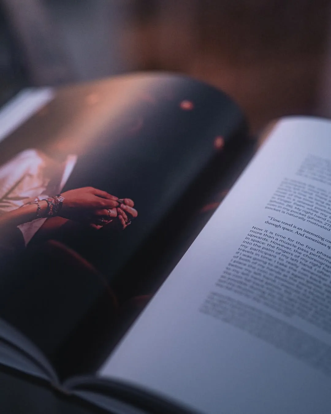
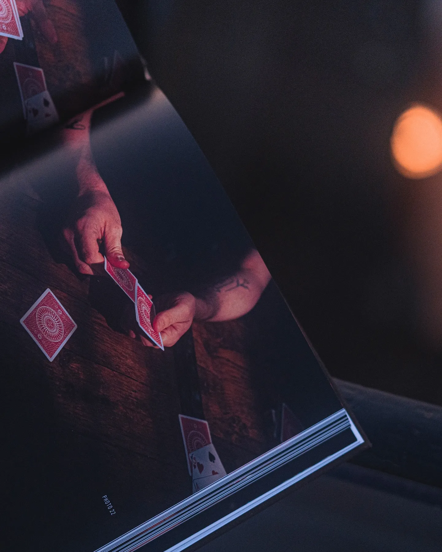
The book is 210 × 260 mm, in a standing format, with 126 pages and more than 100 photographs. Because of the number of photos, we worked with a 12×12 grid for extra flexibility. Many of the photographs act as visual instructions, so each one has to sit within a page or two of the text it explains. I worked out the flow of photos and text across the spreads, after Josefin worked out the layout of the chapter spreads.
Typography
Headings are set in Alternate Gothic Condensed, the instructions in Montserrat, and the script, the words the magician speaks, in Garamond.
Cover
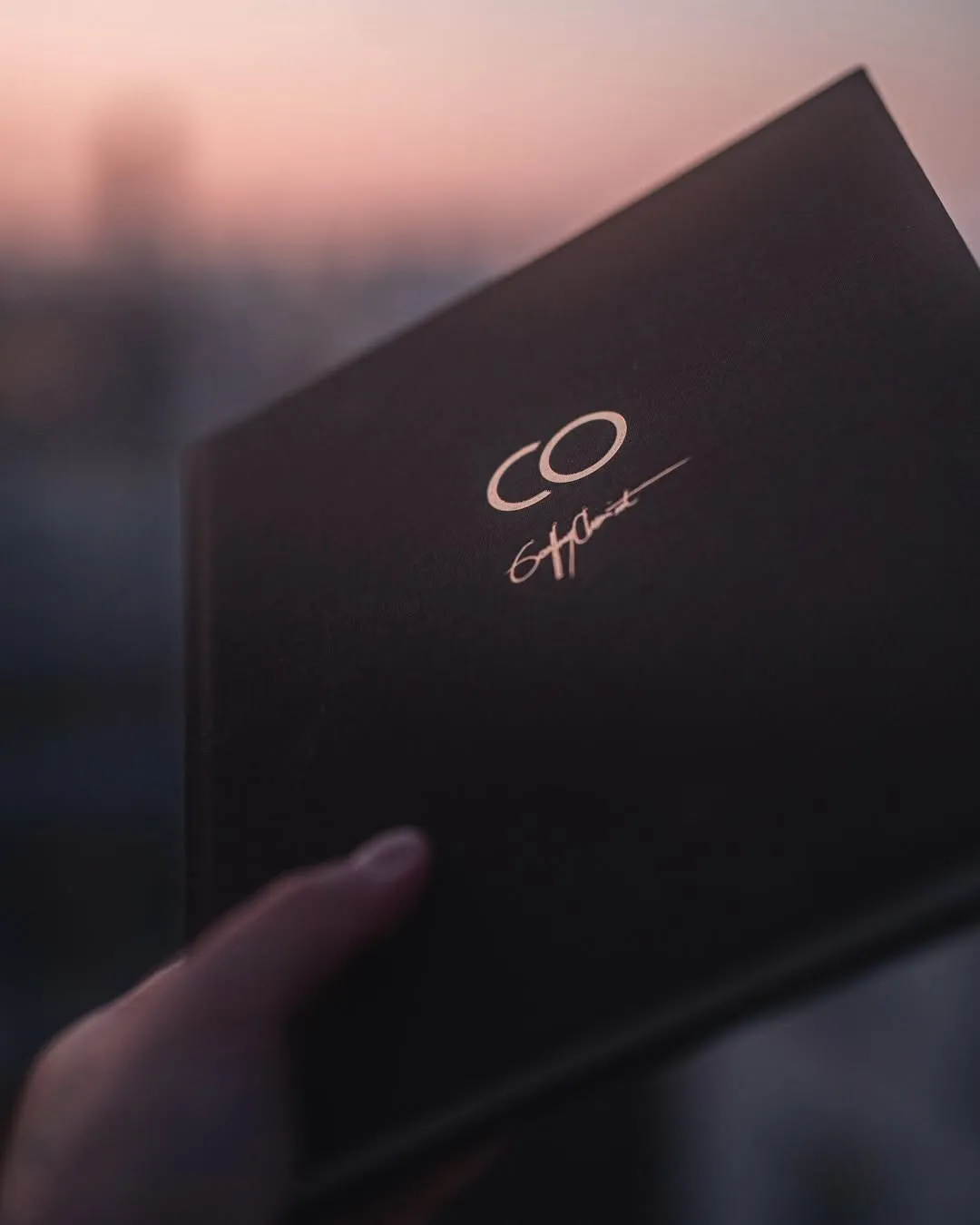
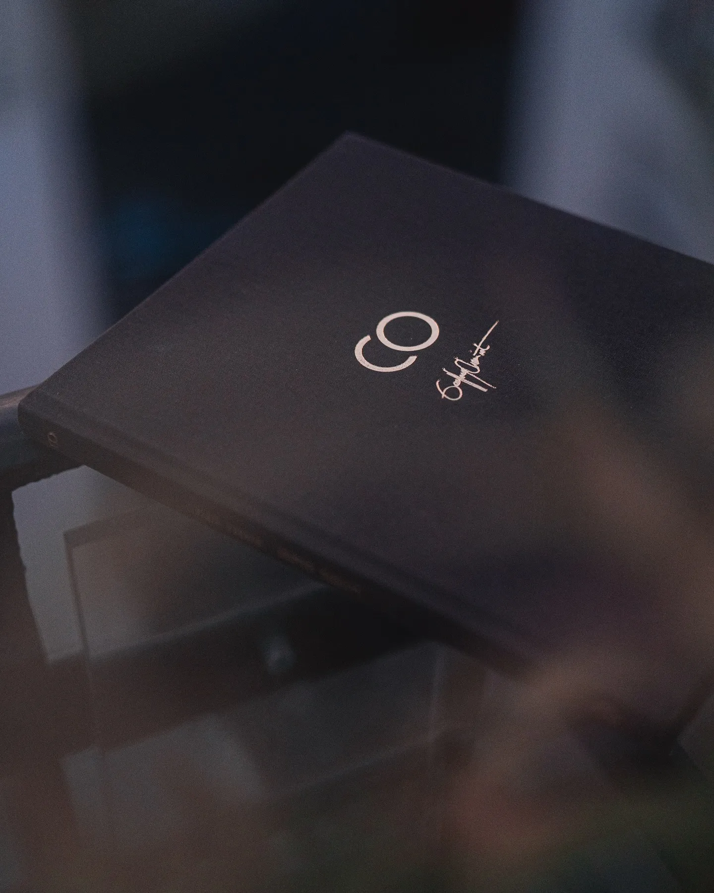
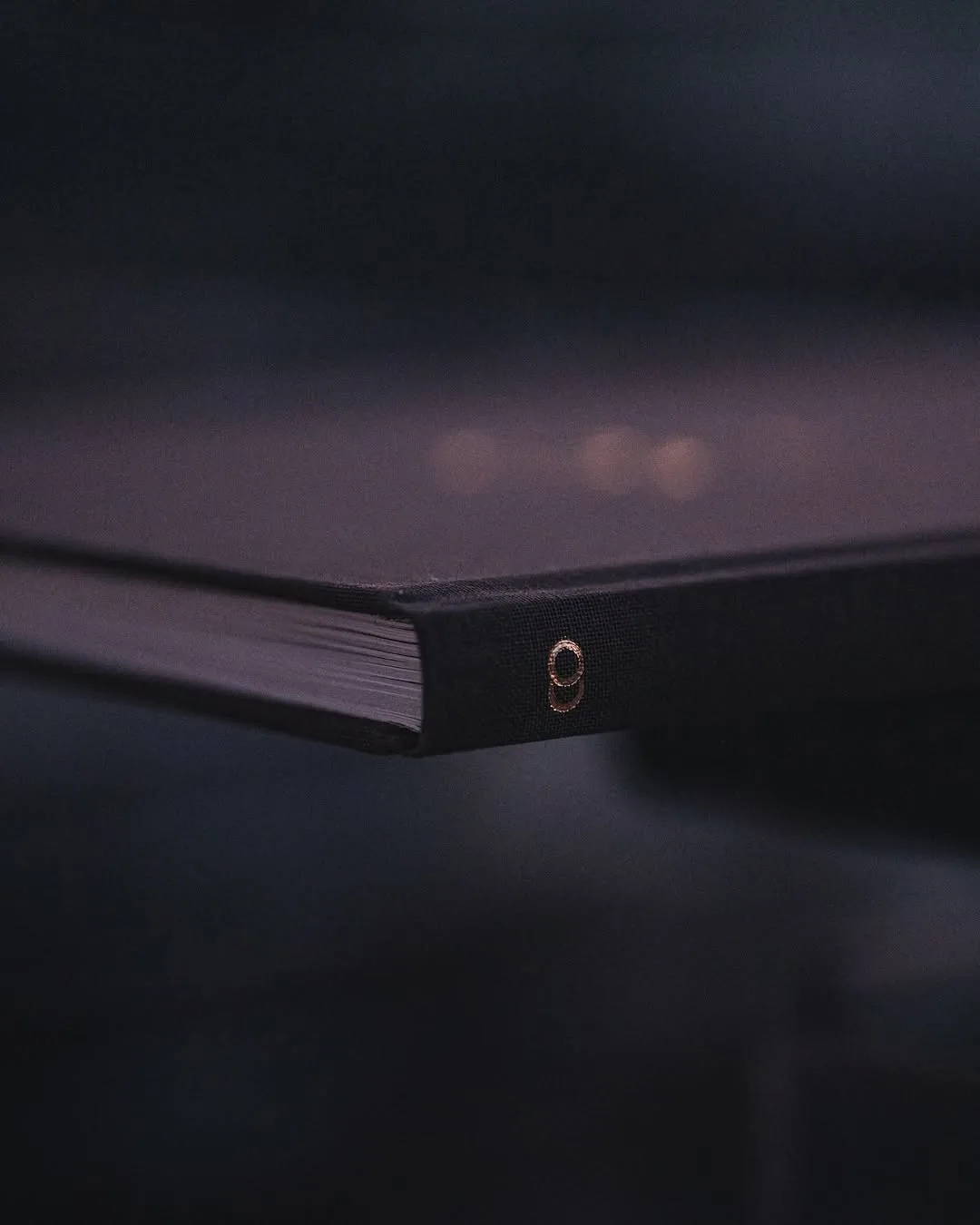
I took Geoffrey’s own draft of the “CO” monogram, which stands for Clair Obscur, and his signature, and turned them into the final cover concept: dark brown cloth with the monogram and signature in gold foil. We wanted the book to feel exclusive and like the result of genuine, hard work, and we put timelessness before modernity.
Production
The book is bound as a traditional hardcover.
The finished book
It was a limited print, sold exclusively through Studio52, and is now sold out. It was very well received. Studio52 describes it as “genuinely one of the most beautifully produced magic books ever made.” Verified customers wrote this in reviews on the Studio52 shop:
…one of the most beautiful magic books I’ve ever held…
This book is a work of art, both the magic effects and the book itself. Excellent photos and well written explanations.
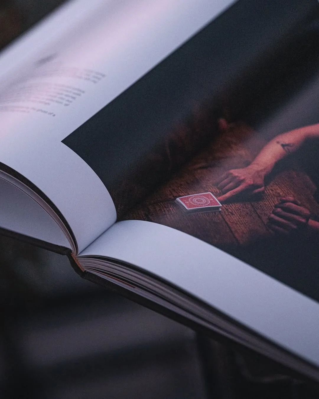
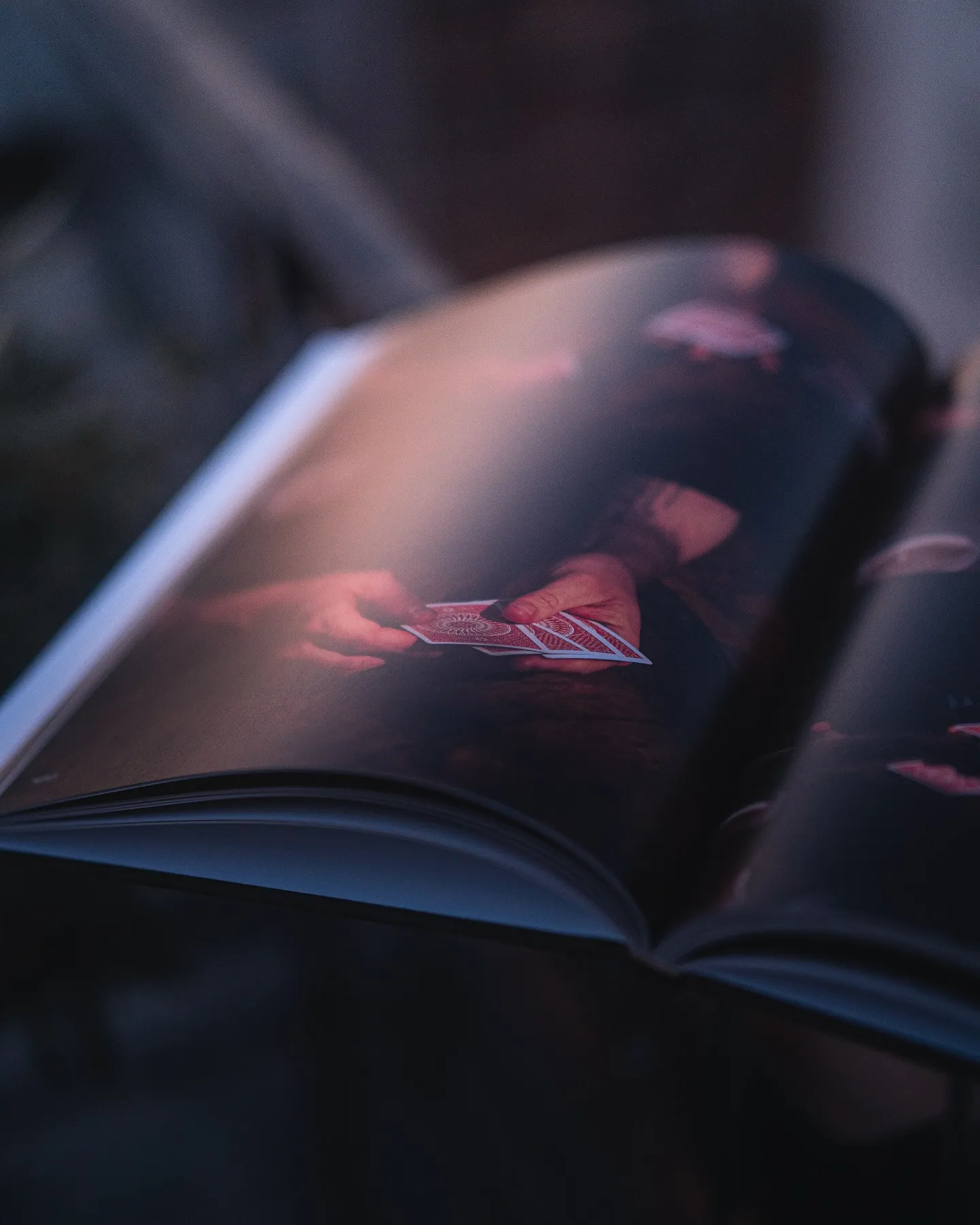
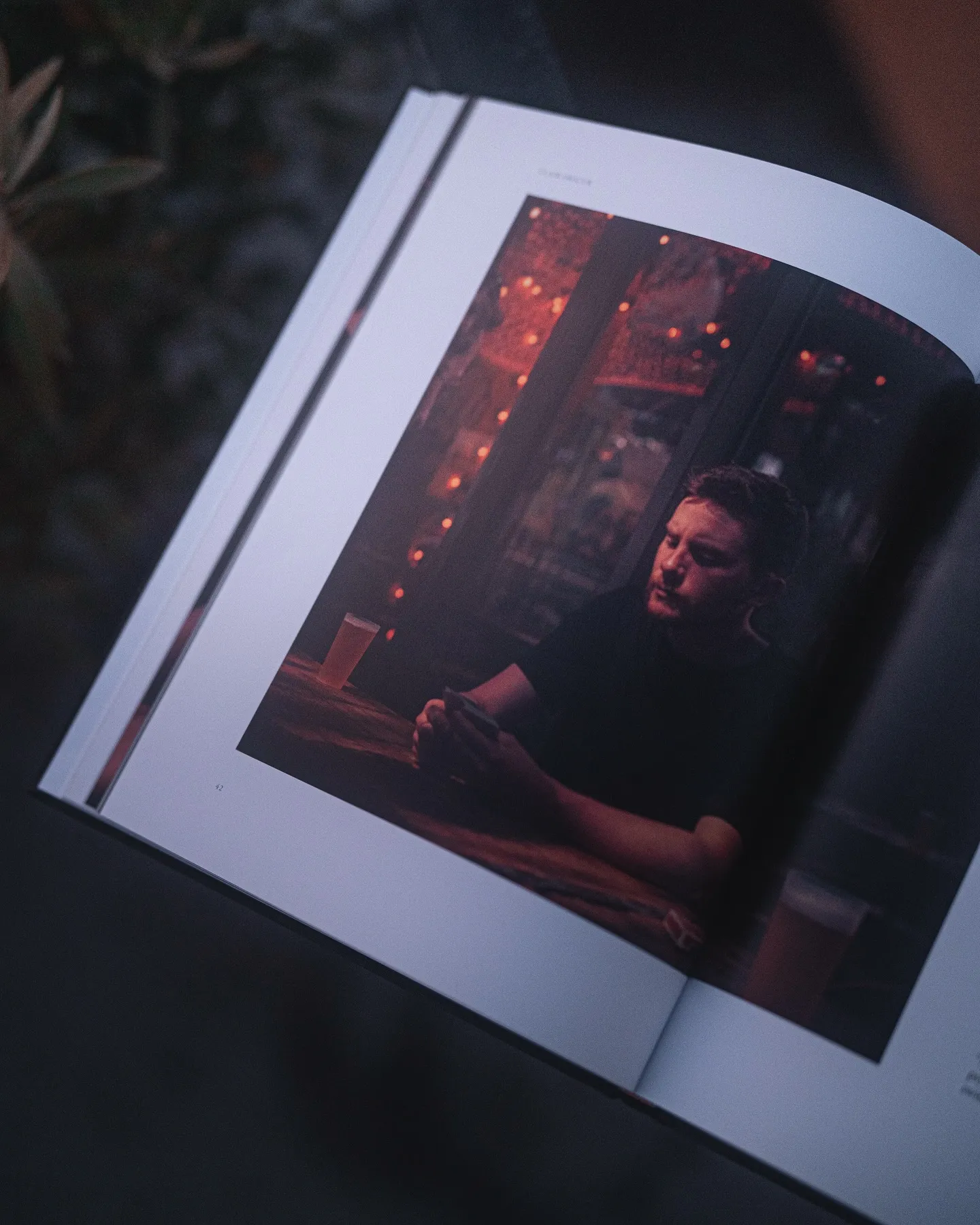
All photographs, in the book and of it, are by Nicolas Nargeot.